
Graphic Design
-
C.J. Ellison possesses a robust background in design, with extensive experience spanning over several years. Her journey began with a formal education in visual arts, providing a solid foundation in design principles, color theory, typography, and composition. She continued building on this foundation through firsthand, professional experience, and earning specialization certification in Graphic Design from CalArts. Over the years, C.J. has honed skills in numerous design software, including Adobe Creative Suite, and has gone on to instruct other creatives in their use.
In addition to traditional graphic design approaches, C.J. has integrated digital painting and illustration into the design process, allowing for a unique fusion of styles that enhances the overall creativity of the work. C.J. has collaborated with clients across different industries, developing work that not only conveys messages effectively but also resonates with target audiences visually. Through these collaborations, a deep understanding of client needs and a commitment to delivering high-quality results have been established, significantly contributing to the growth and reputation within the design community.
Overall, C.J. Ellison’s graphic design background is characterized by a blend of technical skill, artistic vision, and a client-focused approach, ensuring that each project is not only visually stunning but also strategically aligned with each client’s goals.
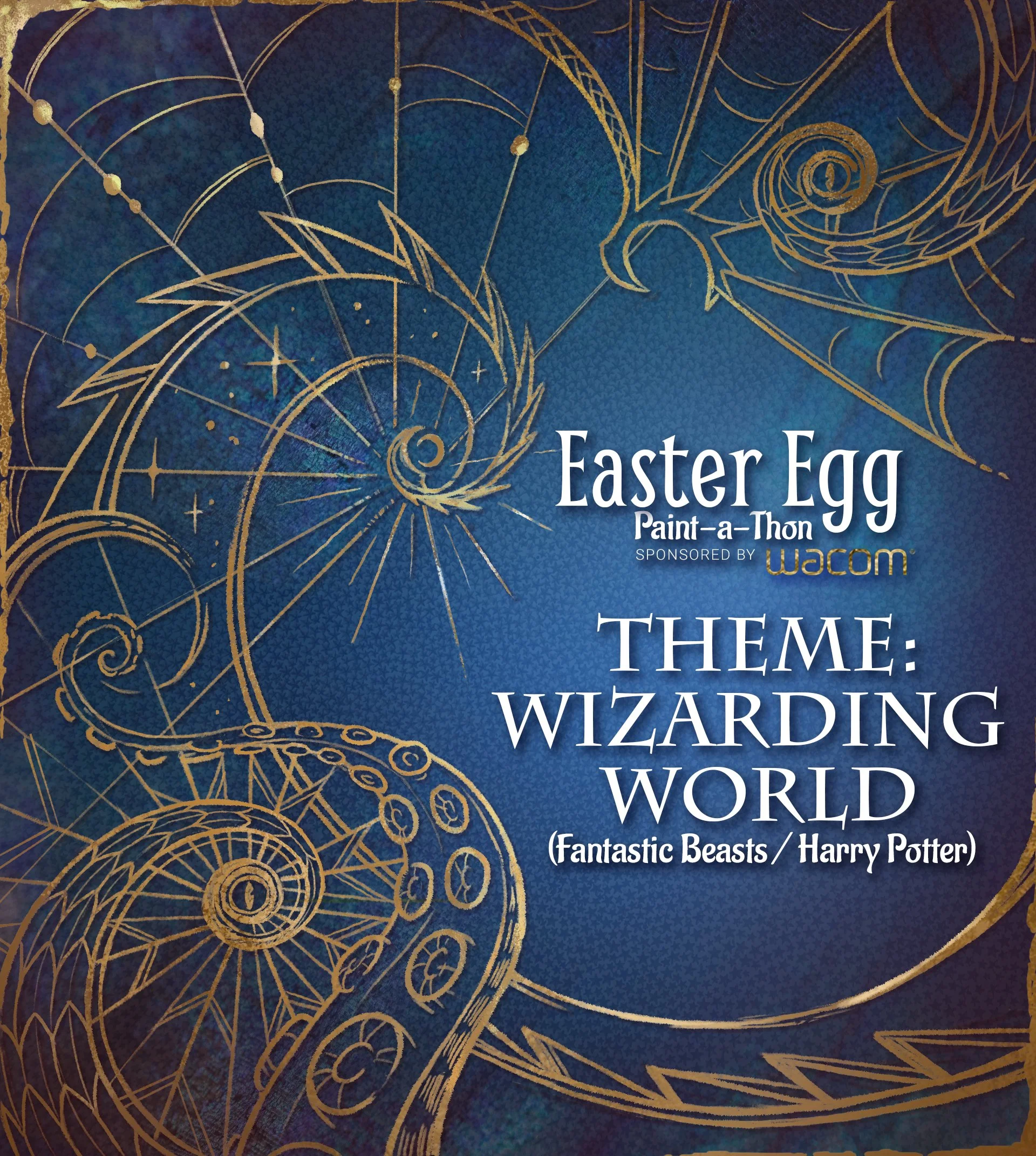
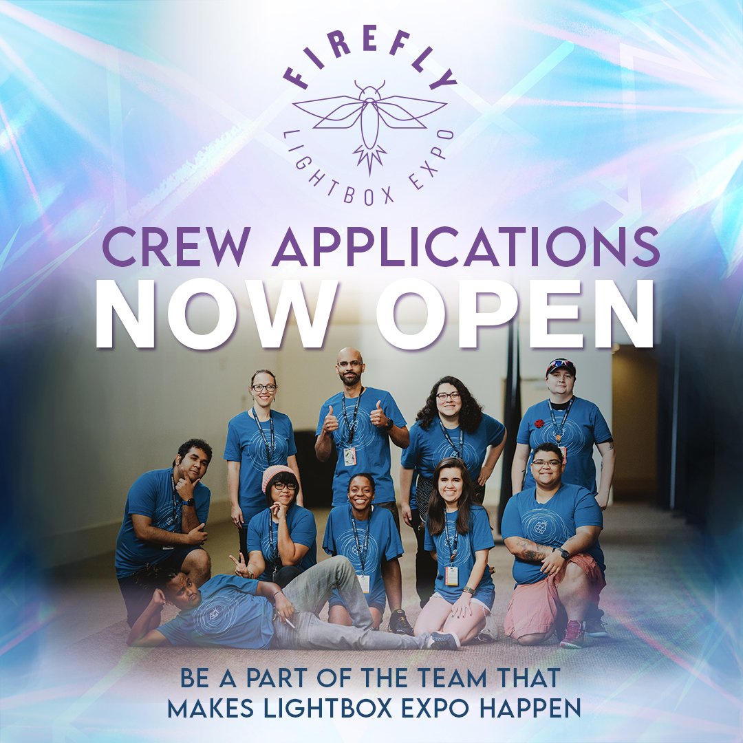
Project: Easter Egg Paint-a-Thon (Wizarding World Theme)
The Easter Egg Paint-a-Thon is LightBox Expo’s 24-hour team art challenge to create a single image with themed easter eggs from a pop culture franchise. The goal for this project was to develop the event's visual identity and intriguing marketing images, hinting at but not giving away the theme.
(Theme reveal image was released after commencement of event) Images created with photo editing, digitally drawn and painted elements, and typesetting. Artwork in finalists image from the top ten art challenge submissions.
Client
LightBox Expo
Year
2022


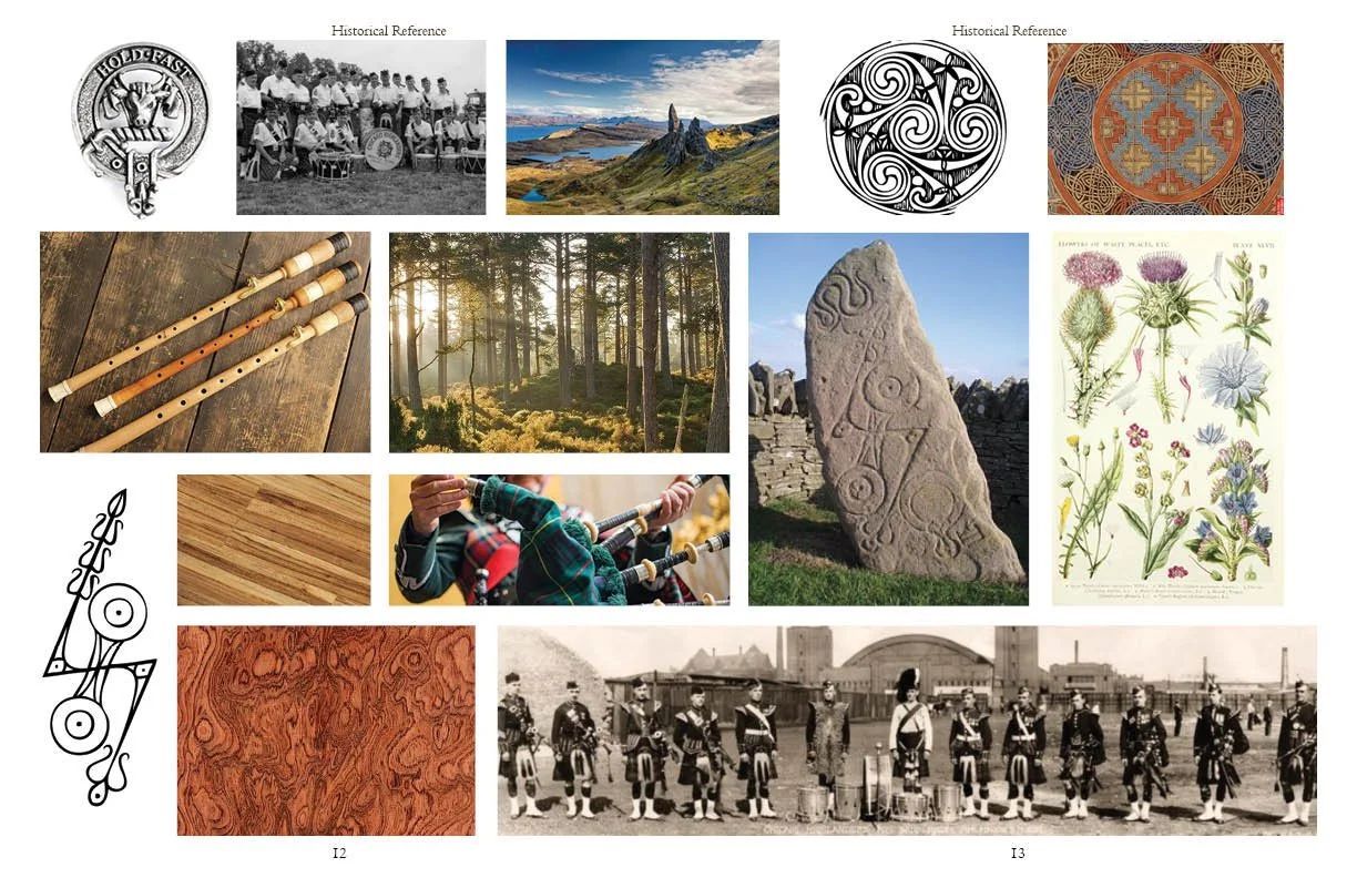
Project: Eceòl (Brand Development)
Eceòl is a personal brand development project for an imagined start-up company created from concept to brand application. The featured start-up was conceptualized as a bagpipe manufacturer who handcrafts the instrument from native hardwoods and sustainable materials. Eco-conscious, and forward-thinking, while still embracing the established heritage of the instrument, the project showcases the ideas and development behind the brand identity.
The brand name is derived from the words ‘eco’ and ‘ceòl’, the Scottish Gaelic word for music. The final logotype features the typeface Californian FB, a serif font with a clean and simple feel yet features marks that bear a subtle resemblance to Celtic calligraphic writing. The line and double dots come from written music, signaling a repeat - a musical nod mirroring the idea of reusing and recycling. The logomark is a stylized gracenote, an iconic feature of bagpipe music with mirrored strokes to look like a tree.
Brand colors were inspired by Harris Tweed’s weaving of the MacLeod of Lewis Tartan. The colors are more muted than the classic tartan with earthy tones still very much connected to natural materials.
Client
Personal
Year
2024


Project: Easter Egg Paint-a-Thon (Superheroes & Villains Theme)
These marketing images were overhauled and expanded on from those received from an outside designer. The original set had a mint green color scheme and featured typefaces that fell short of the intended feeling of the event.
To reference superhero/comic book culture, I brought in new bolder typefaces, completely reworked the design around diagonal shapes and movement, and used a bold white, charcoal, and golden yellow color scheme instead. I also chose images from the judges that showcased their best work better.
Client
LightBox Expo
Year
2023


Project: Promotional Flyers
The following flyers for Grand Dominion by Del Webb were designed to highlight unique resident activities and offerings. Created in Canva, each original design targets specific audiences and interests, and showcases community spirit and diverse engagement opportunities. Bright colors, inviting imagery, and distinct visual styles reflected an active lifestyle and social interactions. This approach emphasized varied community interests and fostered belonging among residents. Each flyer invites exploration of engaging activities, making Grand Dominion a welcoming space for all.
Flyers were used both for digital and print.
Client
Grand Dominion by Del Webb
Year
2024


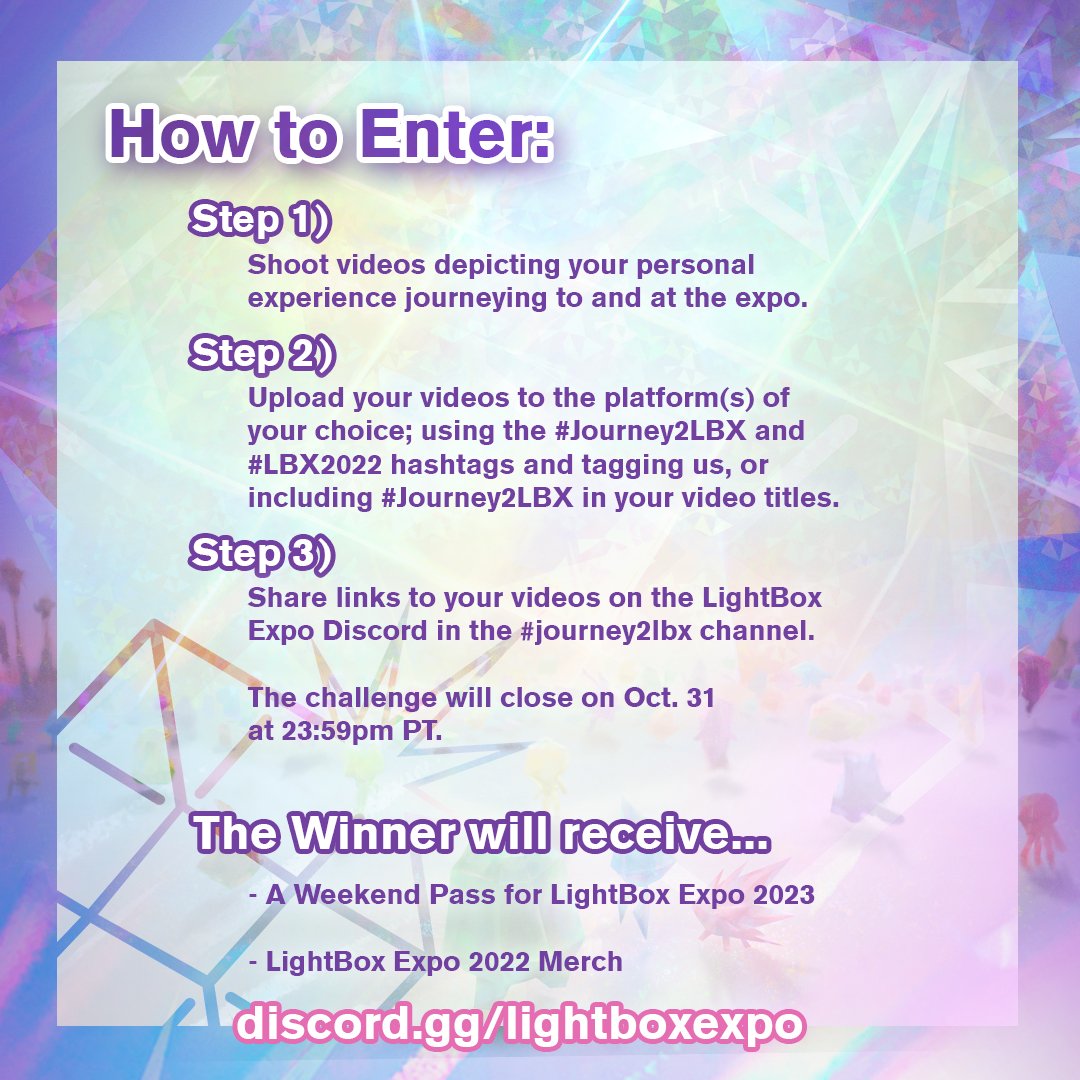
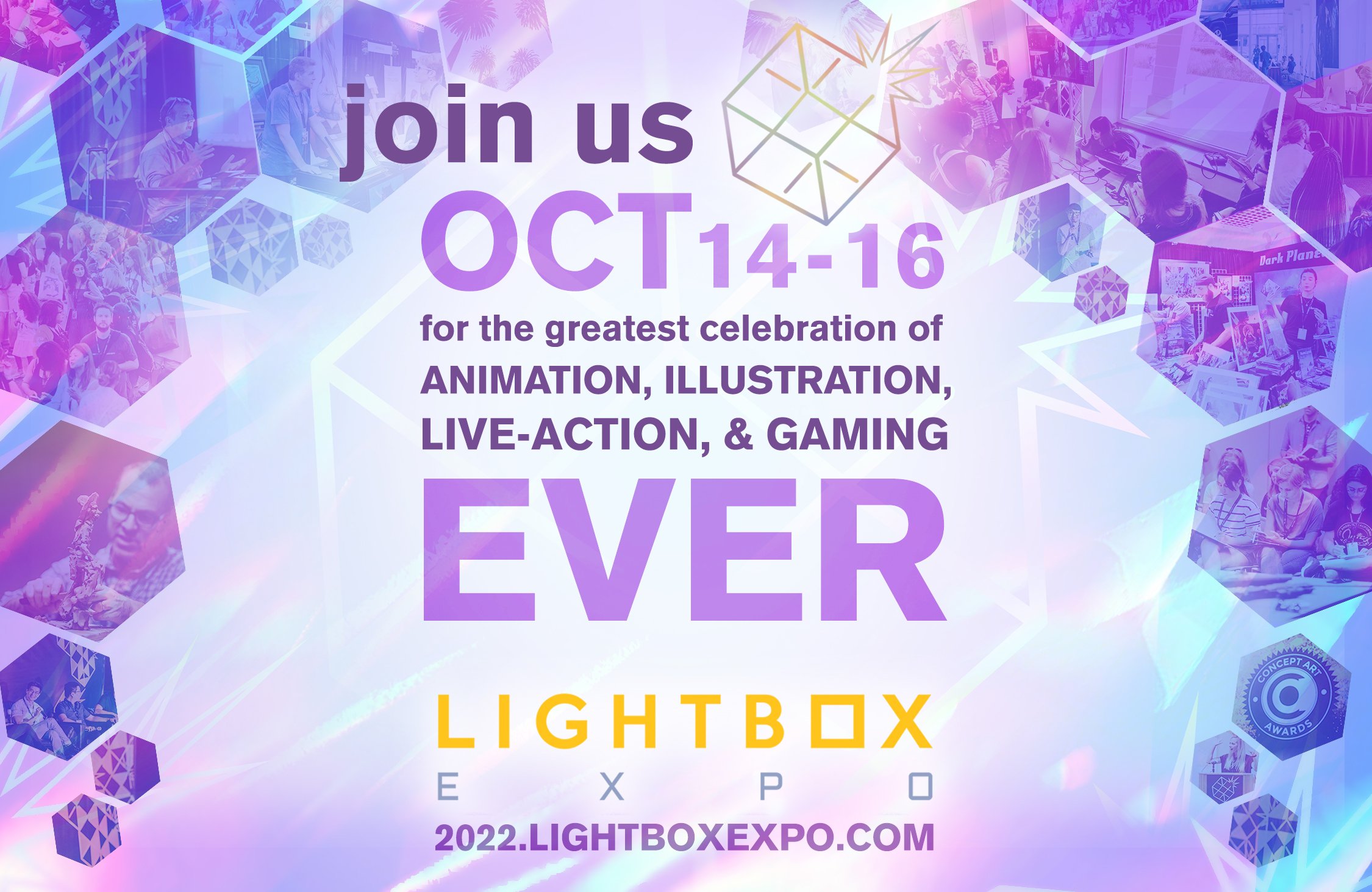
Project: Graphic Assets (LBX 2022)
The assortment of graphics created from LBX branding and type manipulation were created for the purpose of promoting and advertising LightBox Expo 2022, and they are used for digital or print advertisement.
Client
LightBox Expo
Year
2022


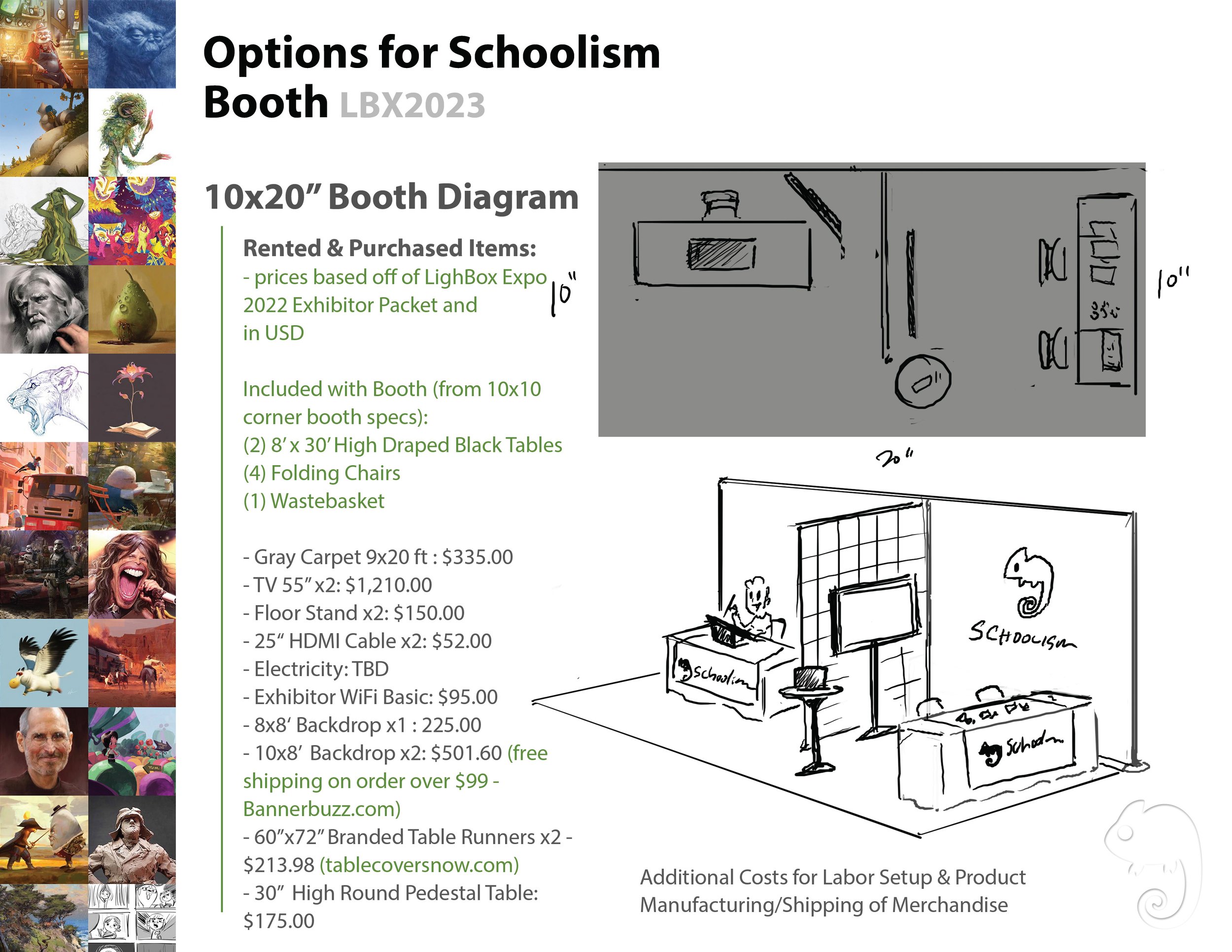
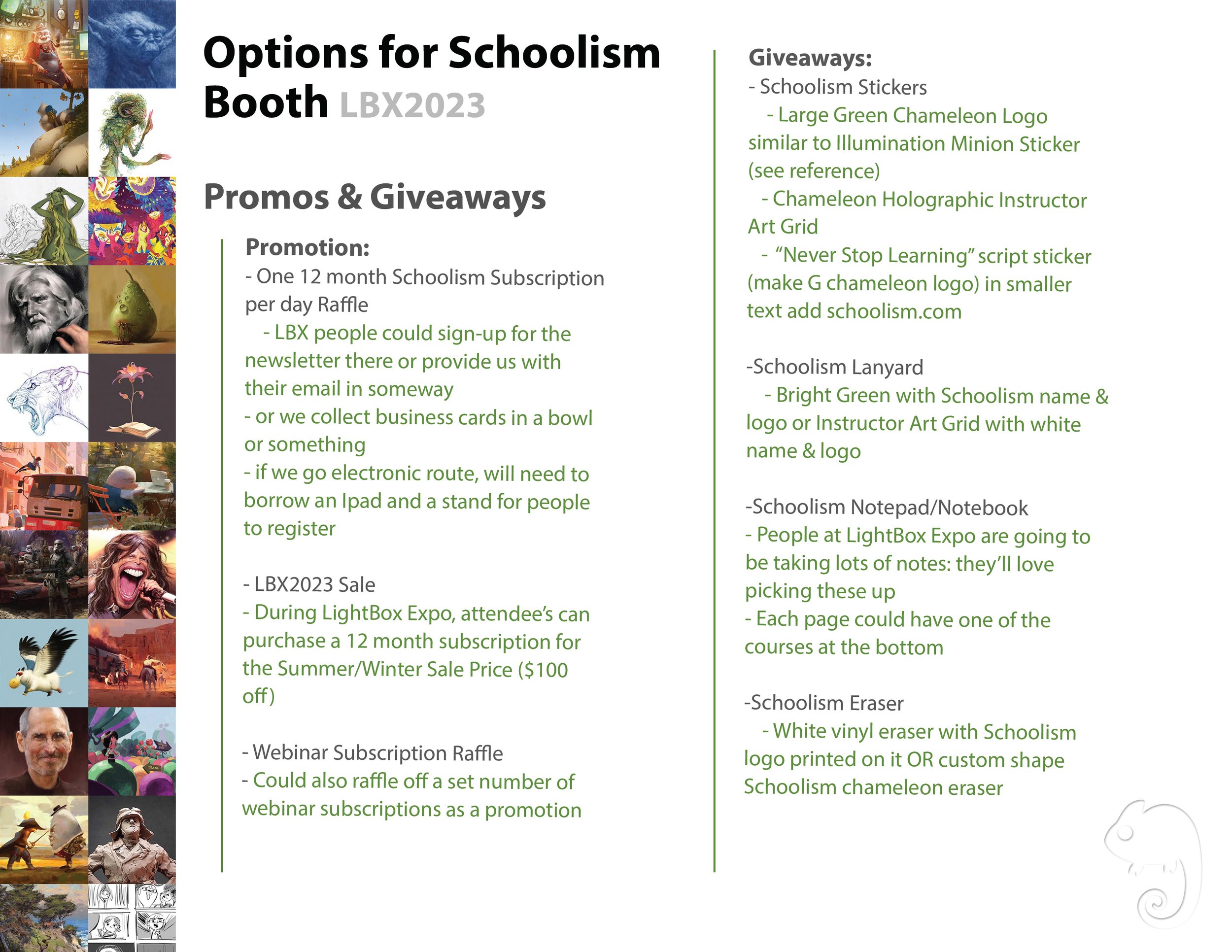
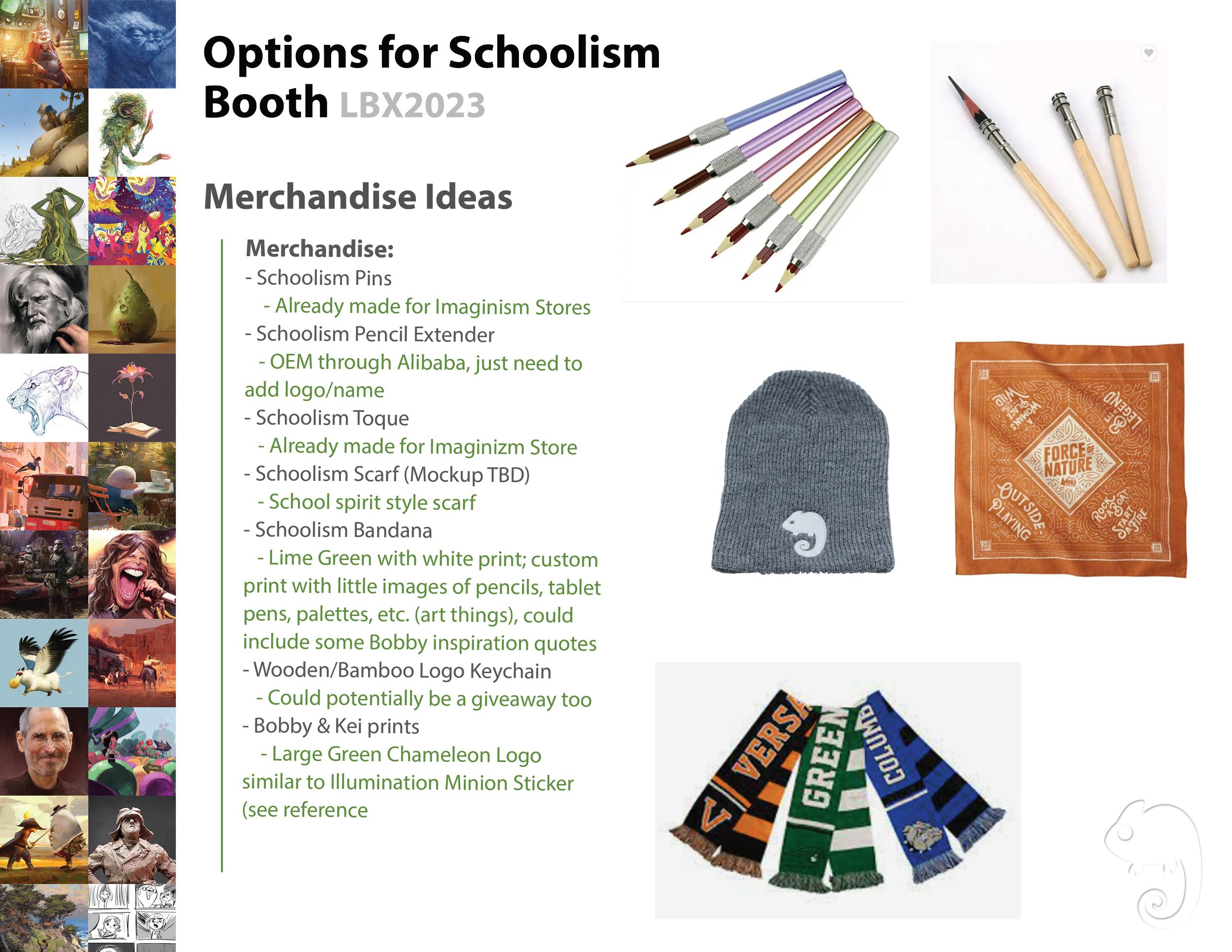
Project:
Schoolism Preliminary Booth Preposal
Proposal developed and assembled for a potential exposition booth for the online art school, Schoolism. The presentations intention was to utlize branding, mock-ups and research to showcase how the school could potentially create an effective, exciting, yet cost-efficient booth for in-person outreach.
Client
Schoolism
Year
2023


Project: Brand Product Application
Eco-Friendly Water Bottle Mock-ups: The goal was to showcase potential applications of the LightBox Expo Brand to open market glass water bottles as a potential luxury merchandise item.
Lanyard Mock-ups: These mock-ups were created as potential options for exclusive lanyards for the staff and faculty to wear. The company wanted lanyards that would clearly stand out from the basic lanyards provided to other exposition attendees and showcase the school as both positive and creative. They were intended to be appealing artists and, as staff and faculty walked around the expo hall interacting with attendees, provide subtle advertising for the school.
Client
LightBox Expo / Imaginism Studios / Schoolism
Year
2022


